Thursday, April 21, 2016
Final Project
I am officially done creating my magazine! This is the link to a site where you can view it, and there are pictures below.
http://joom.ag/2gWQ


http://joom.ag/2gWQ


My Two-Page Spread
For my two-page spread, I wanted to keep the layout clean, but also be able to add pictures and things that the words could go around. I decided to do another picture that takes up the whole page, because I loved the high angle and the proportionment of the cake. This is how the layout ended up looking:


Wednesday, April 20, 2016
My Table of Contents
Editor's Note:


For this page, I am going to put an old black and white picture of my Great Uncle Jesse in his bakery, and a text box of a shortened version of what I put in my previous blog post, "Background Story" on the page in the layout that I have already chosen which is in the blog post, "Planning My Table of Contents." This format and page is similar to Southern Living: Our Best Recipes' first page.
Here is the finished page!

On the Cover:
For this page, I am simply going to use a close up of the Blueberry and Lemon Genoise Muffins, and include the recipe and story behind the recipe, which was included in my previous blog, "Cover Page Recipe."
Here it is!

Table of Contents:
This part is going to follow a similar format to Kraft: Food & Family's table of contents page. I will use colors and an image to make the page more visually appealing.
Here is my table of contents page!

Table of Contents Recipe
For my table of contents dessert image, I decided to make a Texas Sheet Cake. When I was younger, my immediate family flew to Texas like we did about once or twice every year. Once we arrived, my whole family hopped in a few cars and started driving to Oklahoma. We rented a huge cabin with bunk bed, open living spaces, and most importantly, a huge kitchen. It was summer time, and my brother's birthday was during our trip. My grandma and I got busy in the kitchen, making my brother's Texas Sheet Cake birthday cake. This trip is a fond family memory I have, especially baking and spending time with my grandmother because she lives in another state.
I followed my grandmothers recipe and once I was finished, I prepared my set with lights and a camera and began taking pictures!


I followed my grandmothers recipe and once I was finished, I prepared my set with lights and a camera and began taking pictures!


Planning my Table of Contents
I have analyzed two magazine's table of contents and have created an idea in my head of what I want mine to look like. This is what I want the basic layout to look like:


I decided to copy the layout of the "Editor's Note" from Southern Living: Our Best Recipes because I loved the simplicity of it. It is simply a picture and text on a white background. I think it perfectly allows the story to be heard and stand out with a picture to make it more appealing.
Both magazines had a "On the Cover" section of some sort, which I thought was also important to have for my magazine as well. I also want to add a solid color text box like Kraft did to add color to the page while giving a background story to the recipe, which is the overall goal of my magazine. For the layout, I used a similar one to Kraft because I thought the large picture taking up half the page was just the right placement.
I also decided I wanted to use the same text format as Kraft: Food & Family's table of contents because I think it also does a good job of getting the titles and page numbers across but making certain words/letters bolded or colored adds a visual appeal to the page. I also want to add a picture at the bottom just to add another item to the page.
Tuesday, April 19, 2016
Analysis of Table of Contents
Southern Living: Our Best Recipes:
The first page of the magazine is an editor's note that explains the baker's/cook's passion for what she does. I really like this edition, and think I can adapt it to my magazine's "purpose" well.
The second page is the "On Our Cover" recipe of the cinnamon rolls. It also gives credit to the photographer and stylers of the cover page. This is on the left half of the page with a white background. The right half of the page are more credits like the editors, directors, etc. This side is a bright orange color, which adds a nice amount of brightness to the page. I think I will add a text box of color on my magazine's table of contents.
The third page has a picture of a pasta bowl taking up the whole page. The "Contents" title is in the top right hand corner in pink letters, contrasting against the light background. The table of contents part is in a white, translucent text box with pink and black text and page numbers. I don't like the picture covering the entire page, I won't be using this type of layout in my magazine. I think I will add a picture on the page, but figure out something else for the rest of the layout.

Kraft: Food & Family:
The first table of contents page in this magazine is a picture of Creamy Lemon Pasta with Shaved Asparagus. The green in the asparagus is brought out by using green font at the top that says, "spring '14 content." The picture also has a napkin peeking through and asparagus on the sides of the plate that help tie all the colors together and make the picture look complete.
The second page is of the table contents. The left side reads, "the latest" in green text, and below it are the stories/recipes in bold and a description underneath. To the left of every title is a larger font of the page number. The middle and right column is the "on the menu" section, also in green with the same format for the page numbers, story titles, and descriptions.
The bottom of both pages is the "Recipe Index" with three different sections of: Appetizers & Snacks, Salads & Sides, and Entrées & Sandwiches. Under each of these sections are multiple tiny pictures of food recipes with small text to the left of the pictures listing the calories, fat/sodium, carbs, fiber, protein, vitamins, etc. I do not like this portion of the table of contents for my magazine because I think it is distracting. I will use a very similar layout for the other sections, however. I think that the table of contents pages (excluding the recipe index) looked very clean, and were easy to read.


Sunday, April 17, 2016
My Cover Page
For my masthead, I chose colors that I thought properly represented the "Sweet Tooth" title. The colors are baby pink and mint green. To create this font, I drew it out the way I wanted, and then scanned the letters onto my computer.

Next, I drew over the letters with a similar color on my Preview app on my Mac. I decided not to use the tooth anywhere in the graphic because I thought it took away from the 'baking' aspect of the magazine.


Next, I drew over the letters with a similar color on my Preview app on my Mac. I decided not to use the tooth anywhere in the graphic because I thought it took away from the 'baking' aspect of the magazine.

Now, I am going to choose a picture from my choices and create my cover page.
Here is the start of the cover page:

Now for the cover lines and other details...

I decided to use colors and bold letters in my cover lines to draw attention to the more important cover lines. I also added a page number for the cover image's recipe, and a "SUMMER 2016" edition below the masthead.
Wednesday, April 13, 2016
Cover Image: Behind the Scenes
I utilized Pinterest to research a little more about lighting and taking pictures of food. What I learned from watching this video, called Secrets of Food Porn Photos, is that lighting is one of the most important aspects. I wanted to make the muffins' icing shine in the light, and with the sunlight behind them, it didn't look right. So, I used an additional light to shine on my set.

While taking pictures, I had to adjust the set by cutting the flower stems shorter and putting them in a shorter vase so they could fit into the picture better.

Since the magazines I analyzed both had additional items in the cover photo, like a spatula or napkin, I decided to add flowers and a table runner in the back to add more colors on the page. I also decorated the food/plate with mint leaves and blueberries, which go with the flower stems and leaves, the table runner, and the blue blueberries peeping through the muffins.
After the scene was set up, I took lots of photos! Here are the ones I narrowed down, and will choose from for the cover page.


"Secrets of Food Porn Photos." The New York Times. N.p., n.d. Web. 11 Apr. 2016.
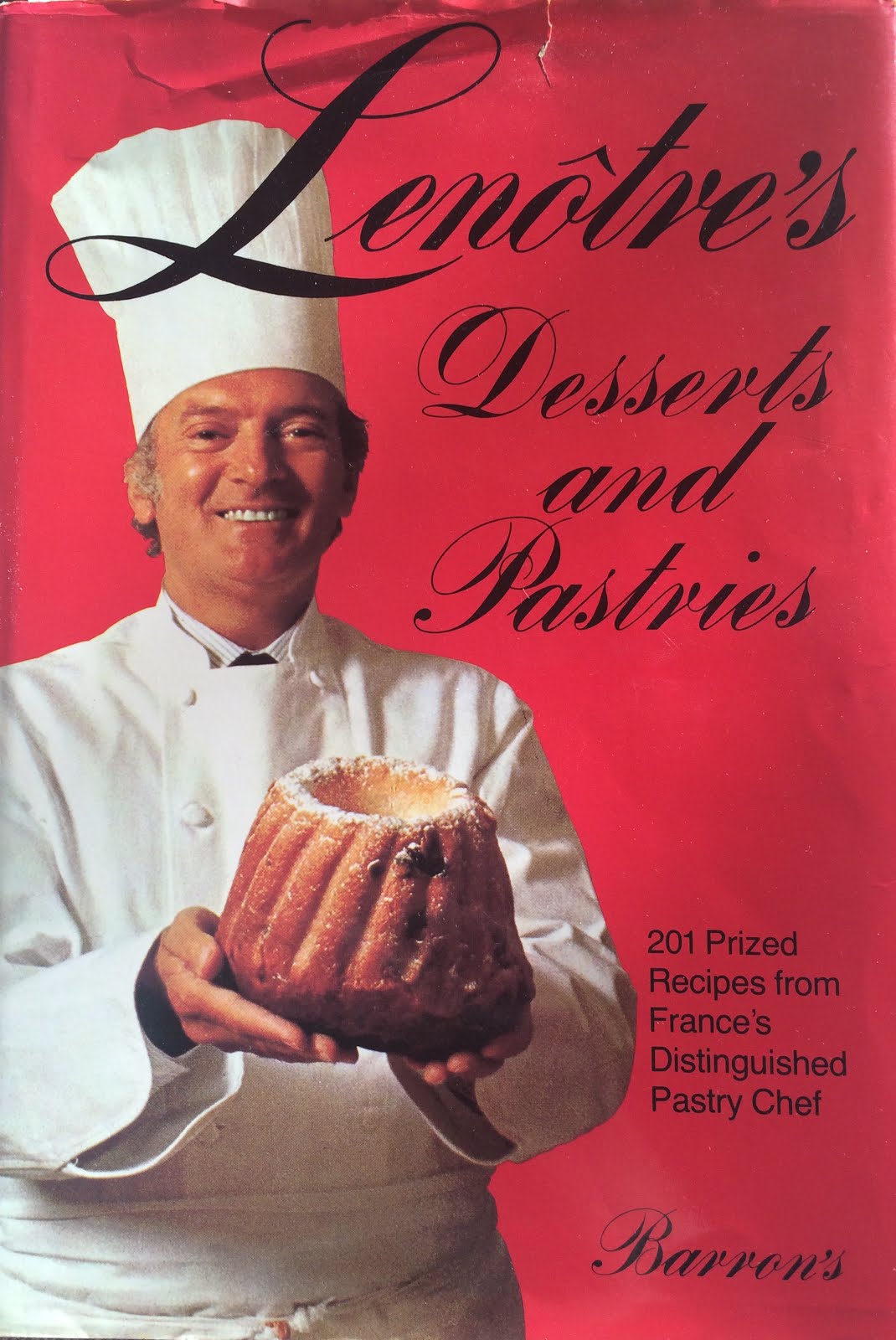
Cover Page Recipe
This week I looked through old recipe books that my great uncle has left for his family after his passing, and decided to use a book called, "Lenotre's Desserts and Pastries." It was a book that he used quite often, including in his bakery. One of the recipes is called a Genoise cake. It was the primary cake batter that he used. I also decided to add blueberries and lemon juice to the cake because I want to keep a summer theme throughout the magazine edition. I made this decision because both the magazines that I analyzed were either a "fall" theme with browns and oranges, or a "spring" theme with rainbow colors and pastels. My theme is "summer," so there are mainly blues and yellows, with some pink. The bright colors, along with the actual fruits used (lemons and blueberries) create a light and fresh feel.
This recipe has character. It is about 40 years old and has been used in a popular bakery from 1960s to 1980s (Andalusia Bake Shop). It was my great uncle's go-to recipe.


This recipe has character. It is about 40 years old and has been used in a popular bakery from 1960s to 1980s (Andalusia Bake Shop). It was my great uncle's go-to recipe.

In the Kitchen
For the cover image's baked good, I first had to check my pantry and see what ingredients I had to buy. I made a list of items I needed and went to the store. Blueberries, lemons, mint leaves, flowers.
Now I have all my ingredients, and I'm ready to start baking.
I got out my great uncle's old recipe book and began making a Genoise cake (adding lemon juice to the batter).


Then, I placed a few washed blueberries into each cup, and baked them at 350 until golden brown.
I made an icing that my mother taught me how to make as a kid. It was her go-to recipe. It is simply: Powdered sugar, milk, and lemon juice stirred together.
Now that the cupcakes are cooled, I took the wrappers off and placed the muffins on a rack which was on top of a cookie sheet. This was to catch the icing that fell off of the muffins while I drizzled it over the muffins.

Now... PICTURE TIME.
Subscribe to:
Posts (Atom)