Sunday, April 17, 2016

My Cover Page

For my masthead, I chose colors that I thought properly represented the "Sweet Tooth" title.  The colors are baby pink and mint green. To create this font, I drew it out the way I wanted, and then scanned the letters onto my computer.


Next, I drew over the letters with a similar color on my Preview app on my Mac. I decided not to use the tooth anywhere in the graphic because I thought it took away from the 'baking' aspect of the magazine.
Now, I am going to choose a picture from my choices and create my cover page.
Here is the start of the cover page: 


Now for the cover lines and other details...


I decided to use colors and bold letters in my cover lines to draw attention to the more important cover lines. I also added a page number for the cover image's recipe, and a "SUMMER 2016" edition below the masthead. 

Wednesday, April 13, 2016

Cover Image: Behind the Scenes

I utilized Pinterest to research a little more about lighting and taking pictures of food. What I learned from watching this video, called Secrets of Food Porn Photos, is that lighting is one of the most important aspects. I wanted to make the muffins' icing shine in the light, and with the sunlight behind them, it didn't look right. So, I used an additional light to shine on my set.

While taking pictures, I had to adjust the set by cutting the flower stems shorter and putting them in a shorter vase so they could fit into the picture better.

Since the magazines I analyzed both had additional items in the cover photo, like a spatula or napkin, I decided to add flowers and a table runner in the back to add more colors on the page. I also decorated the food/plate with mint leaves and blueberries, which go with the flower stems and leaves, the table runner, and the blue blueberries peeping through the muffins.

After the scene was set up, I took lots of photos! Here are the ones I narrowed down, and will choose from for the cover page.


"Secrets of Food Porn Photos." The New York Times. N.p., n.d. Web. 11 Apr. 2016.

Cover Page Recipe

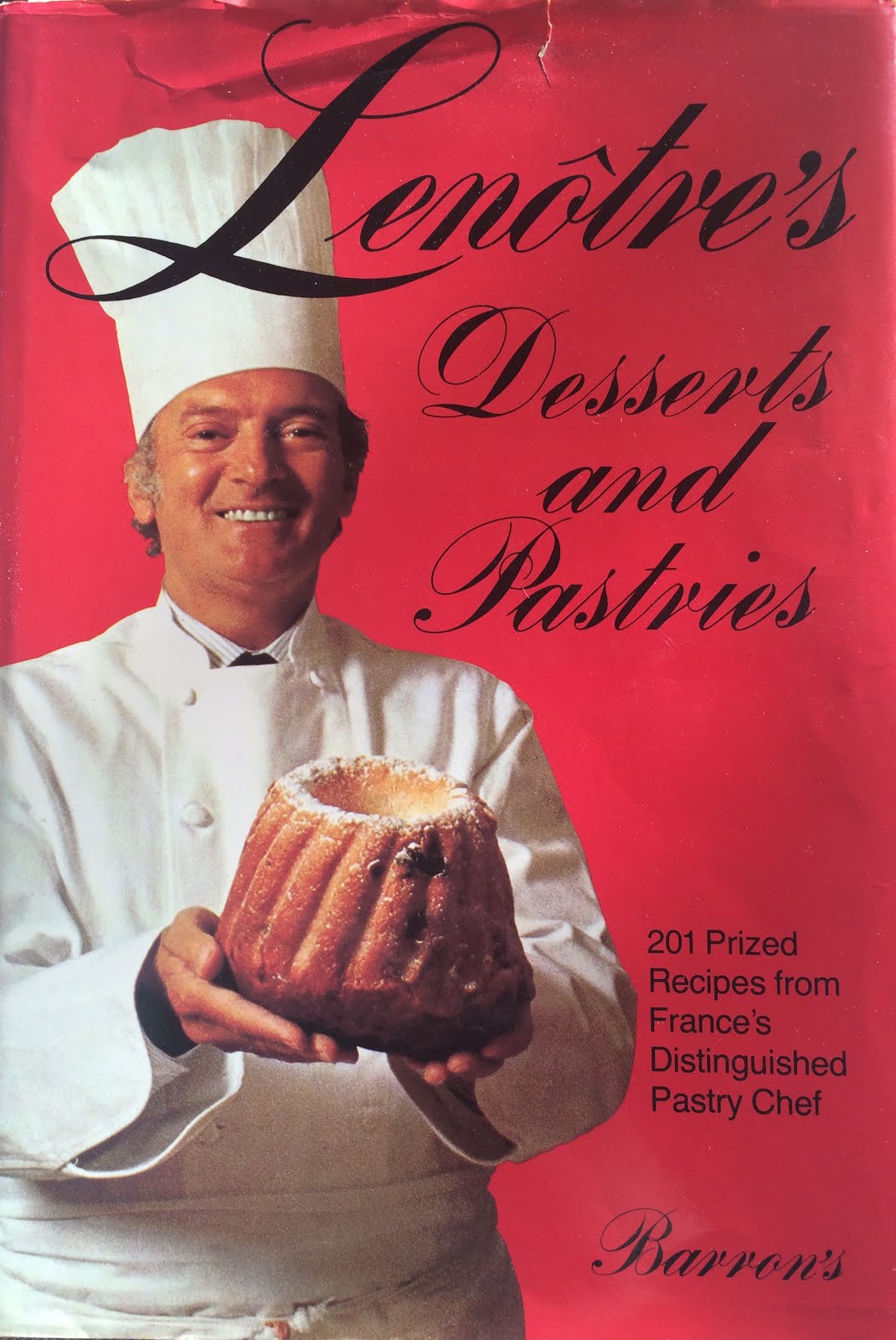
This week I looked through old recipe books that my great uncle has left for his family after his passing, and decided to use a book called, "Lenotre's Desserts and Pastries." It was a book that he used quite often, including in his bakery. One of the recipes is called a Genoise cake. It was the primary cake batter that he used. I also decided to add blueberries and lemon juice to the cake because I want to keep a summer theme throughout the magazine edition. I made this decision because both the magazines that I analyzed were either a "fall" theme with browns and oranges, or a "spring" theme with rainbow colors and pastels. My theme is "summer," so there are mainly blues and yellows, with some pink. The bright colors, along with the actual fruits used (lemons and blueberries) create a light and fresh feel.

This recipe has character. It is about 40 years old and has been used in a popular bakery from 1960s to 1980s (Andalusia Bake Shop). It was my great uncle's go-to recipe.


In the Kitchen

For the cover image's baked good, I first had to check my pantry and see what ingredients I had to buy. I made a list of items I needed and went to the store. Blueberries, lemons, mint leaves, flowers.

Now I have all my ingredients, and I'm ready to start baking.

I got out my great uncle's old recipe book and began making a Genoise cake (adding lemon juice to the batter).


After making this basic batter, I used a tablespoon measure to scoop the batter evenly into mini cupcake pan lined with cupcake wrappers.


Then, I placed a few washed blueberries into each cup, and baked them at 350 until golden brown.

I made an icing that my mother taught me how to make as a kid. It was her go-to recipe. It is simply: Powdered sugar, milk, and lemon juice stirred together.

Now that the cupcakes are cooled, I took the wrappers off and  placed the muffins on a rack which was on top of a cookie sheet. This was to catch the icing that fell off of the muffins while I drizzled it over the muffins.


Now... PICTURE TIME.

Monday, March 28, 2016

Analysis of Two-Page Spread

Southern Living: Our Best Recipes:
There was not a two page spread in the Kraft: Food & Family magazine, and in this one there was not quite a two page spread either - but I got an idea...

I'm thinking that I can do something similar to this page for my two-page spread. I think I will include a full page of solid color, and include the title and a description of the story underneath. Then, I can include a picture of the dessert, and its recipe on the second page.


Thursday, March 17, 2016

Analysis of Cover Pages

Southern Living: Our Best Recipes
This particular edition is Volume 4 from November 2007. The cover page is a picture of cinnamon rolls on a wire rack. The rack is on top of a burgundy cloth napkin, which is on top of a dark, circular, wooden tray. The cinnamon rolls are the main focus with a wooden spatula pulling one of them out, making it appear closer. Parts of the napkin and the tray is blurred on the left side to make the words making up the cover lines, the burgundy napkins on top of two off-white plates are also blurred in the background, to the back left of the cinnamon rolls. Clearly these things are not extremely important indicated by the blurring, however, they do help make up the cover page so they were chosen for a reason. The colors of the napkins, plates, and tray come together with the theme of the edition, which is fall. The cover title is bright yellow and white to contrast against the wooden table in the background. The cover lines are the same colors, and some are larger than others to emphasize them for importance. The cover titles consist mainly of types of recipes (rather than article titles).  The number 131 is the largest to catch the audiences eye, so they know there are 131 recipes in the magazine.


Kraft: Food & Family:
This edition of Kraft: Food & Family is from the spring of 2014. The primary focus of the cover is a rainbow cake. The cake is on a light pink plate with a pastel colored napkin peaking out from under the plate. All the other background images are extremely blurred and not able to make out, so therefore they are not as important as the cake. The cake is what draws attention to the specific audience the magazine is trying to attract, which is people who like to bake. All the colors on the cover page tie together as spring colors. The background colors are orange, pink, and yellow. The cake, which is the main focus, has four layers: pink, orange, green, and blue, iced with white icing. The cover lines are visible but minimal. They are placed on the bottom right hand corner of the page which again, allows more attention to the main image. Numbers are used in this edition as well, but instead of recipes, it says, "51 reasons to celebrate our dreamiest, creamiest desserts." There is also a page reference in small font that gives the reader the page that the image's recipe is located.

Tuesday, March 15, 2016

Purpose

What I would like to get out of this magazine project is that I would like to create a portion of an actual magazine that I would like to make one day. I have always loved baking. I also love trying out new recipes, creating recipes of my own, telling stories, and taking pictures (of things like baked goods). With this magazine, I want there to be a story behind the things that I bake and the recipes in the magazine. I want to not only entertain the readers, but also give them a backstory to what they are eating. I have always wanted to connect with people, and by doing things like sharing family recipes, I can do that.